How to add a color themes(dark mode) functionality
An easy way of implementing light/dark/rainbow theme using CSS and JS

I am a computer science undergraduate at IIIT Guwahati.
Let's learn by doing. We will build an example application and implement a dark/light mode toggle feature. The base HTML template is available here in this GitHub repository, so clone the repository, and get started.
The template has a list of buttons to select a theme.
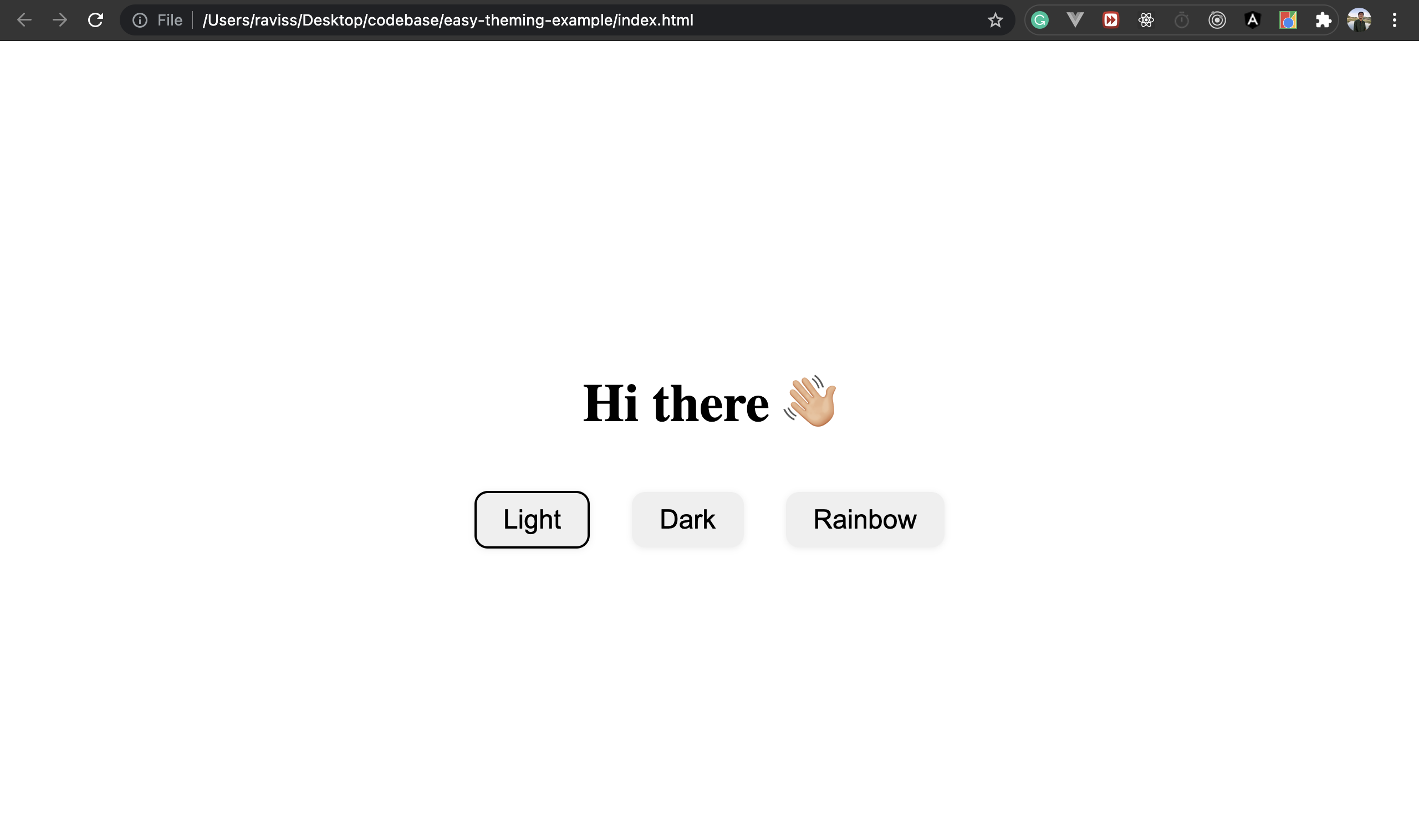
But these button does not work at the moment, some logic has to be added, so let's do that.
We will be using a little bit of javascript to achieve this functionality. So let's add an empty script tag at the end of the body tag.
<!DOCTYPE html>
<html lang="en">
// ...
<body>
    <div class="container">
        // ...
    </div>
    <script>
        // ...
    </script>
</body>
</html>
Now, let's create a variable availableThemes to store all the available theme options, and an another variable selectedTheme to store the selected theme, defaults to light.
<script>
  var availableThemes = {
    "light": {
      id: "light"
    },
    "dark": {
      id: "dark"
    },
    "rainbow": {
      id: "rainbow"
    }
  };
  var selectedTheme = availableThemes.light.id
</script>
We now have a list of available themes stored in a variable, further, we need to add a select functionality to the buttons.
// get switchThemeWrapper and add an onclick event listener
const switchesWrapper = document.getElementById("theme-switch-wrapper");

switchesWrapper.onclick = function(event){
  // If the target element is a button and it is not already selected -> we will fire the chooseTheme function with the clicked themeId
  if(event.target.tagName == "BUTTON" && !event.target.classList.contains("selected")){
    chooseTheme(event.target.getAttribute("data-theme"))
  }
}

function chooseTheme(themeId) {
  selectedTheme = themeId;

  // Updating selected theme switch
  const allSwitches = [...switchesWrapper.getElementsByClassName("theme-switch")];
  allSwitches.forEach(function(switchBtn){
    if(switchBtn.getAttribute("data-theme") == themeId){
      switchBtn.classList.add("selected");
    }
    else {
      switchBtn.classList.remove("selected");
    }
  })
}

Further, we need to add some theme-specific styles. We will be using CSS variables to store the styles(font color, background color, etc).
So let's add a :root selector in the style tag and add some variables to store our default styles, similarly, we will store the corresponding theme styles in the availableThemes variables as well, like this.
:root {
  --primary-color: black;
  --bg: white;
}
html {
  font-size: 24px;
  color: var(--primary-color);
  background: var(--bg);
  animation: var(--animation);
  background-size: var(--bg-size);
}
var availableThemes = {
  "light": {
    id: "light",
    styleVariables: {
      "--primary-color": "black",
      "--bg": "white",
      "--bg-size": "unset",
      "--animation": "unset"
    }
  },
  "dark": {
    id: "dark",
    styleVariables: {
      "--primary-color": "white",
      "--bg": "black",
      "--bg-size": "unset",
      "--animation": "unset"
    }
  },
  "rainbow": {
    id: "rainbow",
    styleVariables: {
      "--primary-color": "black",
      "--bg": "linear-gradient(130deg,#fff 0,#adfbda 10%,#97dcf9 30%,#fda399 50%,#94fb9e 70%,#f7ff99 90%,#fff 100%)",
      "--bg-size": "400% 400%",
      "--animation": "gradient 15s ease infinite"
    }
  }
};
One last step is to toggle these style properties as we click on the buttons, let's add this logic in our
chooseTheme function
function chooseTheme(themeId) {
  selectedTheme = themeId;

  const stylesToApply = availableThemes[themeId].styleVariables;

  Object.keys(stylesToApply).forEach((styleVariable) => {
    document.querySelector(':root').style.setProperty(styleVariable, stylesToApply[styleVariable]);
  })

  // Updating selected theme switch
  const allSwitches = [...switchesWrapper.getElementsByClassName("theme-switch")];
  allSwitches.forEach(function(switchBtn){
    if(switchBtn.getAttribute("data-theme") == themeId){
      switchBtn.classList.add("selected");
    }
    else {
      switchBtn.classList.remove("selected");
    }
  })
}
Aaaaand we are done ✨, let's visit index.html from the browser

You may check out this sandbox to play around with the theme :)
Wuhuuu 🎉.
This was a very basic implementation of this approach, it surely can be improved and molded according to the project requirements.
Edit: The above method works fine if the theme styles are dynamic(getting from the API, etc), but here is a similar way of achieving the above functionality with less javascript
Instead of storing the styles in javascript variables and mutating the CSS properties on theme change, we can assign an attribute(data-theme-selected) to the root element and use this attribute as a style selector, like this:
<!DOCTYPE html>
<html lang="en" data-theme-selected="light">
<head>
  <!-- ... -->
  <style>
    :root[data-theme-selected="light"] {
      --primary-color: black;
      --bg: white;
      --bg-size: unset;
      --animation: unset;
    }
    :root[data-theme-selected="dark"] {
      --primary-color: white;
      --bg: black;
      --bg-size: unset;
      --animation: unset;
    }
    :root[data-theme-selected="rainbow"] {
      --primary-color: black;
      --bg: linear-gradient(130deg,#fff 0,#adfbda 10%,#97dcf9 30%,#fda399 50%,#94fb9e 70%,#f7ff99 90%,#fff 100%);
      --bg-size: 400% 400%;
      --animation: gradient 15s ease infinite;
    }
    html {
      font-size: 24px;
      color: var(--primary-color);
      background: var(--bg);
      animation: var(--animation);
      background-size: var(--bg-size);
    }
    /* ... */
  </style>
</head>
<!-- ...  -->
</html>
And on button click we call the chooseTheme directly,
<div id="theme-switch-wrapper">
  <button class="theme-switch selected" data-theme="light" onclick="chooseTheme('light')">
    Light
  </button>
  <button class="theme-switch" data-theme="dark" onclick="chooseTheme('dark')">
    Dark
  </button>
  <button class="theme-switch" data-theme="rainbow" onclick="chooseTheme('rainbow')">
    Rainbow
  </button>
</div>
function updateSelectedSwitch(themeId){
  const allSwitches = [...document.getElementsByClassName("theme-switch")];
  allSwitches.forEach(function(switchBtn){
    if(switchBtn.getAttribute("data-theme") == themeId){
      switchBtn.classList.add("selected");
    }
    else {
      switchBtn.classList.remove("selected");
    }
  })
}

function chooseTheme(themeId) {
  updateSelectedSwitch(themeId);

  // set the data-theme-selected attribute to reflect the updated theme
  document.querySelector(':root').setAttribute("data-theme-selected", themeId);
}
